
How I built my mega menu
The HTML & CSS I use for my mega menu
I’ve had a bunch of people ask how I built the mega menu on my site, so I figured I’d break it down and share my approach, and my code, so you can recreate it on your own Squarespace build.
The Core Idea
Everything starts with my Mega Menu plugin. If you haven’t used it before, it basically lets you turn any page on your site into a dropdown panel inside your navigation. That means you can design the contents of your mega menu just like a normal page: drag-and-drop blocks, custom layouts, code blocks, full creative freedom.
For my setup, I created three standalone pages:
Resources
Membership
Plugin Store
How It’s Structured
On each page, I added one section with a code block with custom HTML. This handles the layout, icons, link groups, headings, and structure of the dropdown.
Pull the code block full width and height of the section and now you have a blank HTML canvas to play with.
Once I got my HTML in place, next I added Custom CSS in the Custom CSS area, to style the layout and match the rest of my site’s branding.
If you want a similar mega menu, the HTML/CSS below is a great template starting point. Use it as a framework, then plug in your categories, icons, and styling.
Icons & Visuals
Most of my icons came from Lucide.dev—clean, modern, super flexible. A few of the icons were generated by Robo-Will, which honestly works great for matching one-off icons to a specific look.
If you want new icons that blend with Lucide’s style, tell Robo-Will:
“Generate an SVG icon in the style of Lucide for [thing].”
A Pro Tip That Makes This 10× Easier
Use Robo-Will while you’re building these. Seriously—it’s extremely good at:
Drafting the initial HTML for your layout
Cleaning up messy styles
Creating matching hover states
Rewriting your CSS to be more responsive
Generating content blocks faster than you can type
It’s like having a coding partner living inside your Squarespace backend.
Below is the HTML & CSS I used. Drop the HTML into a Code Block on each of your mega menu pages, add the CSS to your Custom CSS panel, and tweak as needed for your brand.
Keep Building,
Will
My “Resources” Menu
<div class="site-wrapper resources-wrapper">
  <div class="resources-grid">
    <div class="resource-column-left">
      <h3>Learn</h3>
      <div class="resource-item">
        <p class="resource-link">
          <a href="/all-resources">
            Tutorials
            <span class="item-arrow">
              <svg xmlns="http://www.w3.org/2000/svg" fill="none" viewBox="0 0 24 24" stroke-width="1.5" stroke="currentColor">
                <path stroke-linecap="round" stroke-linejoin="round" d="M13.5 4.5 21 12m0 0-7.5 7.5M21 12H3" />
              </svg>
            </span>
          </a>
        </p>
      </div>
      <div class="resource-item">
        <p class="resource-link">
          <a href="https://www.youtube.com/@will-myers?sub_confirmation=1" target="_blank">
            Watch Videos
            <span class="item-arrow">
              <svg xmlns="http://www.w3.org/2000/svg" fill="none" viewBox="0 0 24 24" stroke-width="1.5" stroke="currentColor">
                <path stroke-linecap="round" stroke-linejoin="round" d="M13.5 4.5 21 12m0 0-7.5 7.5M21 12H3" />
              </svg>
            </span>
          </a>
        </p>
      </div>
    </div>
    <div class="resource-column-right">
      <h3>Stay Informed</h3>
      <div class="resource-item">
        <p class="resource-link">
          <a href="/newsletter">
            Signup for Newsletter
            <span class="item-arrow">
              <svg xmlns="http://www.w3.org/2000/svg" fill="none" viewBox="0 0 24 24" stroke-width="1.5" stroke="currentColor">
                <path stroke-linecap="round" stroke-linejoin="round" d="M13.5 4.5 21 12m0 0-7.5 7.5M21 12H3" />
              </svg>
            </span>
          </a>
        </p>
      </div>
      <div class="resource-item">
        <p class="resource-link">
          <a href="https://www.instagram.com/willdashmyers/" target="_blank">
            Follow on Instagram
            <span class="item-arrow">
              <svg xmlns="http://www.w3.org/2000/svg" fill="none" viewBox="0 0 24 24" stroke-width="1.5" stroke="currentColor">
                <path stroke-linecap="round" stroke-linejoin="round" d="M13.5 4.5 21 12m0 0-7.5 7.5M21 12H3" />
              </svg>
            </span>
          </a>
        </p>
      </div>
      <div class="resource-item">
        <p class="resource-link">
          <a href="https://www.youtube.com/@will-myers?sub_confirmation=1" target="_blank">
            Subscribe to YouTube
            <span class="item-arrow">
              <svg xmlns="http://www.w3.org/2000/svg" fill="none" viewBox="0 0 24 24" stroke-width="1.5" stroke="currentColor">
                <path stroke-linecap="round" stroke-linejoin="round" d="M13.5 4.5 21 12m0 0-7.5 7.5M21 12H3" />
              </svg>
            </span>
          </a>
        </p>
      </div>
    </div>
  </div>
</div>
#resources-menu {
  .resources-wrapper {
    max-width: 900px;
    margin: 34px auto;
  }

  .resources-grid {
    display: grid;
    grid-template-columns: 1fr 1fr;
    gap: 34px;
  }
  @media (max-width: 900px) {
    .resources-grid {
      grid-template-columns: 1fr;
    }
  }

  .resource-column-right h3,
  .resource-column-left h3 {
    text-transform: uppercase;
    letter-spacing: 0.2em;
    color: violet;
    font-size: 0.85rem;
    font-weight: 600;
    margin: 0;
    margin-bottom: 10px;
  }
  .resource-item p {
    margin-bottom: 0;
    margin: 0px;
    font-size: 2rem;
    font-weight: 700;
    letter-spacing: -0.05em;
  }
  @media (max-width: 900px) {
    .resource-item p {
      font-size: 1.5rem;
    }
  }
  .resource-link a {
    display: inline-flex;
    align-items: center;
    gap: 10px;
    color: #333;
    transition: color 0.2s ease-in-out;
  }

  .resource-item:nth-of-type(1) a:hover {
    color: red;
  }
  .resource-item:nth-of-type(2) a:hover {
    color: green;
  }
  .resource-item:nth-of-type(3) a:hover {
    color: purple;
  }

  .resource-link a:hover .item-arrow {
    opacity: 1;
    transform: translateX(0);
  }
  .item-arrow {
    opacity: 0;
    transform: translateX(-10px);
    width: 1em;
    height: 1em;
    transition: all 0.3s ease;
    display: grid;
    place-items: center;
  }
}
My “Membership” Menu
<div class="site-wrapper membership-wrapper">
  <div class="membership-header">
    <h3>Code Curious Membership</h3>
    <div class="cta-container">
      <a href="/curious-coder-info" class="join-now">
        Join Now
        <span class="item-arrow">
          <svg xmlns="http://www.w3.org/2000/svg" fill="none" viewBox="0 0 24 24" stroke-width="1.5" stroke="currentColor">
            <path stroke-linecap="round" stroke-linejoin="round" d="M13.5 4.5 21 12m0 0-7.5 7.5M21 12H3" />
          </svg>
        </span>
      </a>
      <a href="https://toolkit.will-myers.com/code-catalog/explore" class="learn-more" target="_blank">
        Code Catalog
        <span class="item-arrow">
          <svg xmlns="http://www.w3.org/2000/svg" fill="none" viewBox="0 0 24 24" stroke-width="1.5" stroke="currentColor">
            <path stroke-linecap="round" stroke-linejoin="round" d="M13.5 4.5 21 12m0 0-7.5 7.5M21 12H3" />
          </svg>
        </span>
      </a>
    </div>
  </div>

  <div class="membership-grid">
    <!-- Chrome Extension Card -->
    <a class="feature-card" href="https://chromewebstore.google.com/detail/toolkit-by-will-myers/kidhefkjdhlcjlhpakjofpdamimiihap" target="_blank">
      <div class="feature-icon">
        <svg xmlns="http://www.w3.org/2000/svg" width="24" height="24" viewBox="0 0 24 24" fill="none" stroke="currentColor" stroke-width="2" stroke-linecap="round" stroke-linejoin="round">
          <circle cx="12" cy="12" r="10" />
          <circle cx="12" cy="12" r="4" />
          <line x1="21.17" x2="12" y1="8" y2="8" />
          <line x1="3.95" x2="8.54" y1="6.06" y2="14" />
          <line x1="10.88" x2="15.46" y1="21.94" y2="14" />
        </svg>
      </div>
      <div class="feature-content">
        <h3>Chrome Extension</h3>
        <p>Quick access to your library and pro tools</p>
      </div>
    </a>

    <!-- Robo-Will Card -->
    <a class="feature-card" href="/articles/introducing-robo-will-your-ai-squarespace-design-assistant">
      <div class="feature-icon">
        <svg xmlns="http://www.w3.org/2000/svg" width="24" height="24" viewBox="0 0 24 24" fill="none" stroke="currentColor" stroke-width="2" stroke-linecap="round" stroke-linejoin="round"><path d="M12 6V2H8"/><path d="M15 11v2"/><path d="M2 12h2"/><path d="M20 12h2"/><path d="M20 16a2 2 0 0 1-2 2H8.828a2 2 0 0 0-1.414.586l-2.202 2.202A.71.71 0 0 1 4 20.286V8a2 2 0 0 1 2-2h12a2 2 0 0 1 2 2z"/><path d="M9 11v2"/></svg>
      </div>
      <div class="feature-content">
        <h3>Robo-Will</h3>
        <p>Your AI Coding Assistant in Squarespace</p>
      </div>
    </a>

    <!-- Explore Code Card -->
    <a class="feature-card" href="/catalogue" target="_blank">
      <div class="feature-icon">
        <svg xmlns="http://www.w3.org/2000/svg" width="24" height="24" viewBox="0 0 24 24" fill="none" stroke="currentColor" stroke-width="2" stroke-linecap="round" stroke-linejoin="round">
          <path d="M10 10h4" />
          <path d="M19 7V4a1 1 0 0 0-1-1h-2a1 1 0 0 0-1 1v3" />
          <path d="M20 21a2 2 0 0 0 2-2v-3.851c0-1.39-2-2.962-2-4.829V8a1 1 0 0 0-1-1h-4a1 1 0 0 0-1 1v11a2 2 0 0 0 2 2z" />
          <path d="M 22 16 L 2 16" />
          <path d="M4 21a2 2 0 0 1-2-2v-3.851c0-1.39 2-2.962 2-4.829V8a1 1 0 0 1 1-1h4a1 1 0 0 1 1 1v11a2 2 0 0 1-2 2z" />
          <path d="M9 7V4a1 1 0 0 0-1-1H6a1 1 0 0 0-1 1v3" />
        </svg>
      </div>
      <div class="feature-content">
        <h3>Explore Will's Code Catalog</h3>
        <p>Browse over 120+ code snippets and customizations</p>
      </div>
    </a>

    <!-- Slack Community Card -->
    <a class="feature-card" href="/slack-community">
      <div class="feature-icon">
        <svg
          xmlns="http://www.w3.org/2000/svg"
          width="24"
          height="24"
          viewBox="0 0 24 24"
          fill="none"
          stroke="currentColor"
          stroke-width="2"
          stroke-linecap="round"
          stroke-linejoin="round"
          class="lucide lucide-slack-icon lucide-slack"
        >
          <rect width="3" height="8" x="13" y="2" rx="1.5" />
          <path d="M19 8.5V10h1.5A1.5 1.5 0 1 0 19 8.5" />
          <rect width="3" height="8" x="8" y="14" rx="1.5" />
          <path d="M5 15.5V14H3.5A1.5 1.5 0 1 0 5 15.5" />
          <rect width="8" height="3" x="14" y="13" rx="1.5" />
          <path d="M15.5 19H14v1.5a1.5 1.5 0 1 0 1.5-1.5" />
          <rect width="8" height="3" x="2" y="8" rx="1.5" />
          <path d="M8.5 5H10V3.5A1.5 1.5 0 1 0 8.5 5" />
        </svg>
      </div>
      <div class="feature-content">
        <h3>Slack Community</h3>
        <p>Connect with other Squarespace designers</p>
      </div>
    </a>

    <!-- My Code Library Card -->
    <a class="feature-card" href="https://toolkit.will-myers.com/my-code" target="_blank">
      <div class="feature-icon">
        <svg
          xmlns="http://www.w3.org/2000/svg"
          width="24"
          height="24"
          viewBox="0 0 24 24"
          fill="none"
          stroke="currentColor"
          stroke-width="2"
          stroke-linecap="round"
          stroke-linejoin="round"
          class="lucide lucide-library-icon lucide-library"
        >
          <path d="m16 6 4 14" />
          <path d="M12 6v14" />
          <path d="M8 8v12" />
          <path d="M4 4v16" />
        </svg>
      </div>
      <div class="feature-content">
        <h3>My Code Library</h3>
        <p>Save and organize your favorite snippets</p>
      </div>
    </a>

    <!-- Member Discounts Card -->
    <a class="feature-card" href="/member-discount">
      <div class="feature-icon">
        <svg
          xmlns="http://www.w3.org/2000/svg"
          width="24"
          height="24"
          viewBox="0 0 24 24"
          fill="none"
          stroke="currentColor"
          stroke-width="2"
          stroke-linecap="round"
          stroke-linejoin="round"
          class="lucide lucide-sparkles-icon lucide-sparkles"
        >
          <path
            d="M9.937 15.5A2 2 0 0 0 8.5 14.063l-6.135-1.582a.5.5 0 0 1 0-.962L8.5 9.936A2 2 0 0 0 9.937 8.5l1.582-6.135a.5.5 0 0 1 .963 0L14.063 8.5A2 2 0 0 0 15.5 9.937l6.135 1.581a.5.5 0 0 1 0 .964L15.5 14.063a2 2 0 0 0-1.437 1.437l-1.582 6.135a.5.5 0 0 1-.963 0z"
          />
          <path d="M20 3v4" />
          <path d="M22 5h-4" />
          <path d="M4 17v2" />
          <path d="M5 18H3" />
        </svg>
      </div>
      <div class="feature-content">
        <h3>Member Discounts</h3>
        <p>20% off all plugins</p>
      </div>
    </a>
  </div>
</div>
#membership-menu {
  .membership-wrapper {
    margin: 34px auto;
  }
  .membership-grid {
    display: grid;
    grid-template-columns: 1fr 1fr 1fr;
    gap: 34px;
  }
  @media (max-width: 900px) {
    .membership-grid {
      grid-template-columns: 1fr 1fr;
      gap: 17px;
    }
  }
  @media (max-width: 768px) {
    .membership-grid {
      grid-template-columns: 1fr;
      gap: 8px;
    }
  }

  .feature-card {
    display: flex;
    gap: 12px;
    padding: 12px;
    border-radius: 12px;
    border: 1px solid transparent;
    transition: transform 0.2s ease-in-out;
  }
  .feature-card:hover {
    border: 1px solid #ddd;
    box-shadow: 0 2px 10px rgba(0, 0, 0, 0.05);
    transform: translateY(-2px);
  }
  .feature-icon {
    width: 50px;
    height: 50px;
    flex-shrink: 0;
    display: flex;
    align-items: center;
    justify-content: center;
    color: black;
    font-size: 1.2rem;
    background-color: white;
    border-radius: 5px;
  }
  .feature-content {
    display: flex;
    flex-direction: column;
    flex-grow: 1;
  }
  .feature-card h3 {
    font-size: 1rem;
    font-weight: 600;
    margin: 0;
    color: black;
  }
  .feature-card p {
    font-size: 0.9rem;
    color: #333;
    margin: 0;
  }
  .feature-list {
    display: none;
    margin: 0;
    padding-inline-start: 20px;
  }
  .feature-list li {
    font-size: 0.9rem;
    margin: 0;
    color: #333;
  }
  .cta-button {
    margin-top: auto;
    color: black;
    background: #333;
    text-decoration: none;
    font-size: 0.9rem;
    font-weight: 600;
    padding: 6px;
    border-radius: 0.5rem;
    text-align: center;
  }

  .feature-card:nth-child(1) {
    .feature-icon {
      color: var(--fuchsia);
    }
  }

  .feature-card:nth-child(2) {
    .feature-icon {
      color: var(--green);
    }
  }

  .feature-card:nth-child(3) {
    .feature-icon {
      color: var(--blue);
    }
  }

  .feature-card:nth-child(4) {
    .feature-icon {
      color: var(--red);
    }
  }

  .feature-card:nth-child(5) {
    .feature-icon {
      color: var(--yellow);
    }
  }

  .feature-card:nth-child(6) {
    .feature-icon {
      color: var(--violet);
    }
  }

  .membership-header {
    text-align: center;
    margin-bottom: 34px;
  }
  .membership-header h3 {
    text-transform: uppercase;
    color: #333;
    letter-spacing: 0.2em;
    font-size: 0.85rem;
    font-weight: 600;
    margin: 0;
    margin-bottom: 34px;
  }
  .membership-header p {
    margin-bottom: 0;
    margin: 0px;
    font-size: 2rem;
    font-weight: 700;
    letter-spacing: -0.05em;
  }
  .cta-container {
    display: flex;
    gap: 68px;
    justify-content: center;
  }
  a.join-now,
  a.learn-more {
    min-width: 180px;
    margin: 0px;
    font-size: 0.9rem;
    text-transform: uppercase;
    letter-spacing: 0.1em;
    font-size: 0.85rem;
    font-weight: 600;
    padding: 8px 16px;
    border-radius: 8px;
    position: relative;
    display: inline-flex;
    align-items: center;
    justify-content: center;
    gap: 7px;
  }
  a.join-now {
    background-color: var(--violet);
    color: #ffffff;
  }
  a.join-now:hover {
    opacity: 0.8;
  }

  a.learn-more {
    background-color: #ddd;
    color: #333;
  }
  a.learn-more:hover {
    background-color: white
  }

  a.join-now:hover .item-arrow,
  a.learn-more:hover .item-arrow {
    transform: translateX(4px);
  }

  .item-arrow {
    width: 1em;
    height: 1em;
    display: grid;
    place-items: center;
    position: relative;
    transition: all 0.3s ease;
  }


  @media screen and (max-width: 768px) {
    .cta-container {
      flex-direction: column;
      gap: 17px;
    }
  }
}
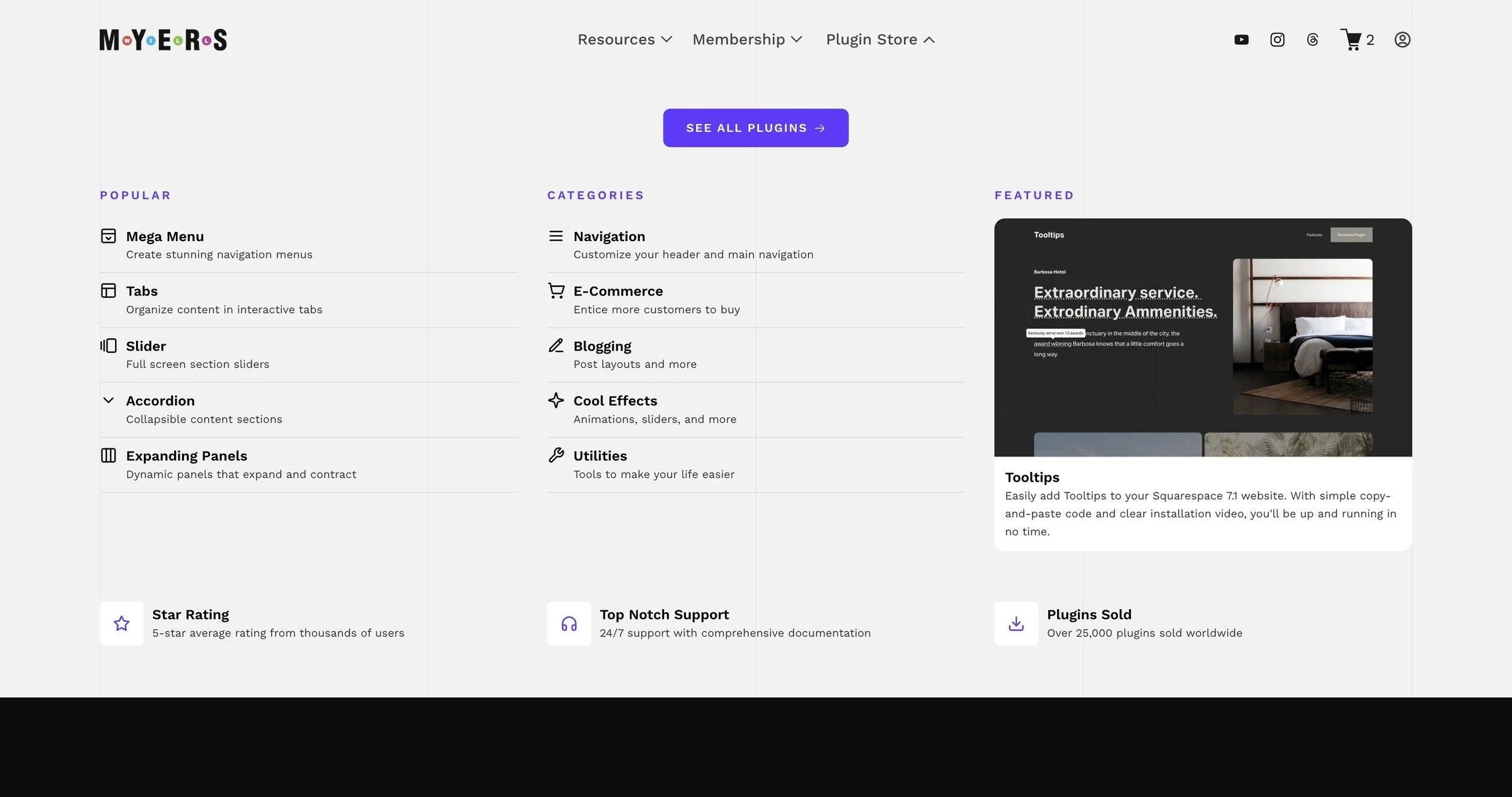
Plugin Store
<div class="site-wrapper plugins-wrapper">
  <div class="plugins-header">
    <!-- <h3>Plugins</h3> -->
    <a href="/products" class="see-all-plugins">
      See All Plugins
      <span class="item-arrow">
        <svg xmlns="http://www.w3.org/2000/svg" fill="none" viewBox="0 0 24 24" stroke-width="1.5" stroke="currentColor">
          <path stroke-linecap="round" stroke-linejoin="round" d="M13.5 4.5 21 12m0 0-7.5 7.5M21 12H3" />
        </svg>
      </span>
    </a>
  </div>

  <div class="main-grid">
    <!-- Popular Plugins -->
    <div class="section-card popular-card">
      <h3 class="section-title">Popular</h3>
      <ul class="item-list">
        <li class="item">
          <a href="/products/p/mega-menu-for-squarespace-71">
            <div class="item-icon">
              <svg
                xmlns="http://www.w3.org/2000/svg"
                width="24"
                height="24"
                viewBox="0 0 24 24"
                fill="none"
                stroke="currentColor"
                stroke-width="2"
                stroke-linecap="round"
                stroke-linejoin="round"
                class="lucide lucide-panel-top-open-icon lucide-panel-top-open"
              >
                <rect width="18" height="18" x="3" y="3" rx="2" />
                <path d="M3 9h18" />
                <path d="m15 14-3 3-3-3" />
              </svg>
            </div>
            <div class="item-content">
              <h3>
                <span>
                  Mega Menu
                  <span class="item-arrow">
                    <svg xmlns="http://www.w3.org/2000/svg" fill="none" viewBox="0 0 24 24" stroke-width="1.5" stroke="currentColor">
                      <path stroke-linecap="round" stroke-linejoin="round" d="M13.5 4.5 21 12m0 0-7.5 7.5M21 12H3" />
                    </svg>
                  </span>
                </span>
              </h3>
              <p>Create stunning navigation menus</p>
            </div>
          </a>
        </li>
        <li class="item">
          <a href="/products/p/tabs-plugin-for-squarespace">
            <div class="item-icon">
              <svg
                xmlns="http://www.w3.org/2000/svg"
                width="24"
                height="24"
                viewBox="0 0 24 24"
                fill="none"
                stroke="currentColor"
                stroke-width="2"
                stroke-linecap="round"
                stroke-linejoin="round"
                class="lucide lucide-panels-top-left-icon lucide-panels-top-left"
              >
                <rect width="18" height="18" x="3" y="3" rx="2" />
                <path d="M3 9h18" />
                <path d="M9 21V9" />
              </svg>
            </div>
            <div class="item-content">
              <h3>
                <span>
                  Tabs
                  <span class="item-arrow">
                    <svg xmlns="http://www.w3.org/2000/svg" fill="none" viewBox="0 0 24 24" stroke-width="1.5" stroke="currentColor">
                      <path stroke-linecap="round" stroke-linejoin="round" d="M13.5 4.5 21 12m0 0-7.5 7.5M21 12H3" />
                    </svg>
                  </span>
                </span>
              </h3>
              <p>Organize content in interactive tabs</p>
            </div>
          </a>
        </li>
        <li class="item">
          <a href="/products/p/sliding-image-banner">
            <div class="item-icon">
              <svg
                xmlns="http://www.w3.org/2000/svg"
                width="24"
                height="24"
                viewBox="0 0 24 24"
                fill="none"
                stroke="currentColor"
                stroke-width="2"
                stroke-linecap="round"
                stroke-linejoin="round"
                class="lucide lucide-gallery-horizontal-end-icon lucide-gallery-horizontal-end"
              >
                <path d="M2 7v10" />
                <path d="M6 5v14" />
                <rect width="12" height="18" x="10" y="3" rx="2" />
              </svg>
            </div>
            <div class="item-content">
              <h3>
                <span>
                  Slider
                  <span class="item-arrow">
                    <svg xmlns="http://www.w3.org/2000/svg" fill="none" viewBox="0 0 24 24" stroke-width="1.5" stroke="currentColor">
                      <path stroke-linecap="round" stroke-linejoin="round" d="M13.5 4.5 21 12m0 0-7.5 7.5M21 12H3" />
                    </svg>
                  </span>
                </span>
              </h3>
              <p>Full screen section sliders</p>
            </div>
          </a>
        </li>
        <li class="item">
          <a href="/products/p/accordion-dropdown-plugin-for-squarespace">
            <div class="item-icon">
              <svg width="20" height="20" viewBox="0 0 24 24" fill="none" stroke="currentColor" stroke-width="2" stroke-linecap="round" stroke-linejoin="round">
                <path d="m6 9 6 6 6-6" />
              </svg>
            </div>
            <div class="item-content">
              <h3>
                <span>
                  Accordion
                  <span class="item-arrow">
                    <svg xmlns="http://www.w3.org/2000/svg" fill="none" viewBox="0 0 24 24" stroke-width="1.5" stroke="currentColor">
                      <path stroke-linecap="round" stroke-linejoin="round" d="M13.5 4.5 21 12m0 0-7.5 7.5M21 12H3" />
                    </svg>
                  </span>
                </span>
              </h3>
              <p>Collapsible content sections</p>
            </div>
          </a>
        </li>
        <li class="item">
          <a href="/products/p/expanding-panels">
            <div class="item-icon">
              <svg
                xmlns="http://www.w3.org/2000/svg"
                width="24"
                height="24"
                viewBox="0 0 24 24"
                fill="none"
                stroke="currentColor"
                stroke-width="2"
                stroke-linecap="round"
                stroke-linejoin="round"
                class="lucide lucide-columns3-icon lucide-columns-3"
              >
                <rect width="18" height="18" x="3" y="3" rx="2" />
                <path d="M9 3v18" />
                <path d="M15 3v18" />
              </svg>
            </div>
            <div class="item-content">
              <h3>
                <span>
                  Expanding Panels
                  <span class="item-arrow">
                    <svg xmlns="http://www.w3.org/2000/svg" fill="none" viewBox="0 0 24 24" stroke-width="1.5" stroke="currentColor">
                      <path stroke-linecap="round" stroke-linejoin="round" d="M13.5 4.5 21 12m0 0-7.5 7.5M21 12H3" />
                    </svg>
                  </span>
                </span>
              </h3>
              <p>Dynamic panels that expand and contract</p>
            </div>
          </a>
        </li>
      </ul>
    </div>

    <!-- Categories -->
    <div class="section-card categories-card">
      <h3 class="section-title">Categories</h3>
      <ul class="item-list">
        <li class="item">
          <a href="/products?filter=navigation">
            <div class="item-icon">
              <svg width="20" height="20" viewBox="0 0 24 24" fill="none" stroke="currentColor" stroke-width="2" stroke-linecap="round" stroke-linejoin="round">
                <line x1="4" x2="20" y1="12" y2="12" />
                <line x1="4" x2="20" y1="6" y2="6" />
                <line x1="4" x2="20" y1="18" y2="18" />
              </svg>
            </div>
            <div class="item-content">
              <h3>
                <span>
                  Navigation
                  <span class="item-arrow">
                    <svg xmlns="http://www.w3.org/2000/svg" fill="none" viewBox="0 0 24 24" stroke-width="1.5" stroke="currentColor">
                      <path stroke-linecap="round" stroke-linejoin="round" d="M13.5 4.5 21 12m0 0-7.5 7.5M21 12H3" />
                    </svg>
                  </span>
                </span>
              </h3>
              <p>Customize your header and main navigation</p>
            </div>
          </a>
        </li>
        <li class="item">
          <a href="/products?filter=ecommerce">
            <div class="item-icon">
              <svg width="20" height="20" viewBox="0 0 24 24" fill="none" stroke="currentColor" stroke-width="2" stroke-linecap="round" stroke-linejoin="round">
                <circle cx="8" cy="21" r="1" />
                <circle cx="19" cy="21" r="1" />
                <path d="M2.05 2.05h2l2.66 12.42a2 2 0 0 0 2 1.58h9.78a2 2 0 0 0 1.95-1.57L23 6H6" />
              </svg>
            </div>
            <div class="item-content">
              <h3>
                <span>
                  E-Commerce
                  <span class="item-arrow">
                    <svg xmlns="http://www.w3.org/2000/svg" fill="none" viewBox="0 0 24 24" stroke-width="1.5" stroke="currentColor">
                      <path stroke-linecap="round" stroke-linejoin="round" d="M13.5 4.5 21 12m0 0-7.5 7.5M21 12H3" />
                    </svg>
                  </span>
                </span>
              </h3>
              <p>Entice more customers to buy</p>
            </div>
          </a>
        </li>
        <li class="item">
          <a href="/products?filter=blogging">
            <div class="item-icon">
              <svg width="20" height="20" viewBox="0 0 24 24" fill="none" stroke="currentColor" stroke-width="2" stroke-linecap="round" stroke-linejoin="round">
                <path d="M12 20h9" />
                <path d="M16.5 3.5a2.12 2.12 0 0 1 3 3L7 19l-4 1 1-4Z" />
                <path d="m15 5 3 3" />
              </svg>
            </div>
            <div class="item-content">
              <h3>
                <span>
                  Blogging
                  <span class="item-arrow">
                    <svg xmlns="http://www.w3.org/2000/svg" fill="none" viewBox="0 0 24 24" stroke-width="1.5" stroke="currentColor">
                      <path stroke-linecap="round" stroke-linejoin="round" d="M13.5 4.5 21 12m0 0-7.5 7.5M21 12H3" />
                    </svg>
                  </span>
                </span>
              </h3>
              <p>Post layouts and more</p>
            </div>
          </a>
        </li>
        <li class="item">
          <a href="/products?filter=cool-effects">
            <div class="item-icon">
              <svg width="20" height="20" viewBox="0 0 24 24" fill="none" stroke="currentColor" stroke-width="2" stroke-linecap="round" stroke-linejoin="round">
                <path
                  d="M9.937 15.5A2 2 0 0 0 8.5 14.063l-6.135-1.582a.5.5 0 0 1 0-.962L8.5 9.936A2 2 0 0 0 9.937 8.5l1.582-6.135a.5.5 0 0 1 .963 0L14.063 8.5A2 2 0 0 0 15.5 9.937l6.135 1.582a.5.5 0 0 1 0 .962L15.5 14.063a2 2 0 0 0-1.437 1.437l-1.582 6.135a.5.5 0 0 1-.963 0z"
                />
              </svg>
            </div>
            <div class="item-content">
              <h3>
                <span>
                  Cool Effects
                  <span class="item-arrow">
                    <svg xmlns="http://www.w3.org/2000/svg" fill="none" viewBox="0 0 24 24" stroke-width="1.5" stroke="currentColor">
                      <path stroke-linecap="round" stroke-linejoin="round" d="M13.5 4.5 21 12m0 0-7.5 7.5M21 12H3" />
                    </svg>
                  </span>
                </span>
              </h3>
              <p>Animations, sliders, and more</p>
            </div>
          </a>
        </li>
        <li class="item">
          <a href="/products?filter=utilities">
            <div class="item-icon">
              <svg width="20" height="20" viewBox="0 0 24 24" fill="none" stroke="currentColor" stroke-width="2" stroke-linecap="round" stroke-linejoin="round">
                <path d="M14.7 6.3a1 1 0 0 0 0 1.4l1.6 1.6a1 1 0 0 0 1.4 0l3.77-3.77a6 6 0 0 1-7.94 7.94l-6.91 6.91a2.12 2.12 0 0 1-3-3l6.91-6.91a6 6 0 0 1 7.94-7.94l-3.76 3.76z" />
              </svg>
            </div>
            <div class="item-content">
              <h3>
                <span>
                  Utilities
                  <span class="item-arrow">
                    <svg xmlns="http://www.w3.org/2000/svg" fill="none" viewBox="0 0 24 24" stroke-width="1.5" stroke="currentColor">
                      <path stroke-linecap="round" stroke-linejoin="round" d="M13.5 4.5 21 12m0 0-7.5 7.5M21 12H3" />
                    </svg>
                  </span>
                </span>
              </h3>
              <p>Tools to make your life easier</p>
            </div>
          </a>
        </li>
      </ul>
    </div>

    <!-- Featured Plugin -->
    <div class="section-card featured-card">
      <h3 class="section-title">Featured</h3>
      <a class="featured-item" href="/products/p/tooltips-for-squarespace">
        <div class="featured-image">
          <img src="https://images.squarespace-cdn.com/content/v1/5dec0d775605ee7848f9f1e6/2e19eb4b-62a2-4834-ae3a-7c642470fd60/Screen+Recording+2025-06-23+at+2.35.14%E2%80%AFPM.gif?format=1500w" />
        </div>
        <div class="featured-content">
          <h3>Tooltips</h3>
          <p>Easily add Tooltips to your Squarespace 7.1 website. With simple copy-and-paste code and clear installation video, you'll be up and running in no time.</p>
        </div>
      </a>
    </div>
  </div>

  <!-- Marketing Section -->
  <div class="section-card marketing-card">
    <div class="marketing-grid">
      <div class="marketing-item">
        <div class="item-icon">
          <svg width="20" height="20" viewBox="0 0 24 24" fill="none" stroke="currentColor" stroke-width="2" stroke-linecap="round" stroke-linejoin="round">
            <polygon points="12,2 15.09,8.26 22,9.27 17,14.14 18.18,21.02 12,17.77 5.82,21.02 7,14.14 2,9.27 8.91,8.26" />
          </svg>
        </div>
        <div class="item-content">
          <h3>Star Rating</h3>
          <p>5-star average rating from thousands of users</p>
        </div>
      </div>
      <div class="marketing-item">
        <div class="item-icon">
          <svg width="20" height="20" viewBox="0 0 24 24" fill="none" stroke="currentColor" stroke-width="2" stroke-linecap="round" stroke-linejoin="round">
            <path d="M3 18v-6a9 9 0 0 1 18 0v6" />
            <path d="M21 19a2 2 0 0 1-2 2h-1a2 2 0 0 1-2-2v-3a2 2 0 0 1 2-2h3zM3 19a2 2 0 0 0 2 2h1a2 2 0 0 0 2-2v-3a2 2 0 0 0-2-2H3z" />
          </svg>
        </div>
        <div class="item-content">
          <h3>Top Notch Support</h3>
          <p>24/7 support with comprehensive documentation</p>
        </div>
      </div>
      <div class="marketing-item">
        <div class="item-icon">
          <svg width="20" height="20" viewBox="0 0 24 24" fill="none" stroke="currentColor" stroke-width="2" stroke-linecap="round" stroke-linejoin="round">
            <path d="M21 15v4a2 2 0 0 1-2 2H5a2 2 0 0 1-2-2v-4" />
            <polyline points="7,10 12,15 17,10" />
            <line x1="12" x2="12" y1="15" y2="3" />
          </svg>
        </div>
        <div class="item-content">
          <h3>Plugins Sold</h3>
          <p>Over 25,000 plugins sold worldwide</p>
        </div>
      </div>
    </div>
  </div>
</div>
#plugin-store-menu {
  .plugins-wrapper {
    margin: 34px auto;
  }
  .main-grid {
    display: grid;
    gap: 34px;
    grid-template-columns: 1fr 1fr 1fr;
  }

  @media (max-width: 1024px) {
    .main-grid {
      grid-template-columns: 1fr 1fr;
    }
  }
  @media (max-width: 768px) {
    .main-grid {
      grid-template-columns: 1fr;
    }
  }

  .section-card {
    padding: 12px 0px;
    border-radius: 12px;
  }
  .section-title {
    text-transform: uppercase;
    color: violet;
    letter-spacing: 0.2em;
    font-size: 0.85rem;
    font-weight: 600;
    margin: 0;
    margin-bottom: 17px;
  }

  .item-list {
    list-style: none;
    margin-block-start: 0;
    margin-block-end: 0;
    padding-inline-start: 0px;
  }
  .item > a {
    position: relative;
    display: flex;
    align-items: start;
    padding: 10px 0;
    gap: 10px;
    border-bottom: 1px solid #ddd;
  }
  .item .item-icon {
    width: 20px;
    height: 20px;
    display: flex;
    align-items: center;
    justify-content: center;
    color: black;
    font-size: 1.2rem;
  }
  .item h3,
  .marketing-item h3 {
    color: black;
    font-size: 1rem;
    font-weight: 600;
    margin: 0;
    display: flex;
    align-items: center;
    gap: 10px;
  }
  .item h3 > span {
    position: relative;
  }
  .item p,
  .marketing-item p {
    font-size: 0.8rem;
    line-clamp: 1;
    display: -webkit-box;
    -webkit-line-clamp: 1;
    -webkit-box-orient: vertical;
    overflow: hidden;
    color: #333;
    margin: 0;
    margin-bottom: 0;
  }

  .item .item-arrow {
    opacity: 0;
    position: absolute;
    right: calc(-1em - 10px);
    transform: translateX(-10px);
    width: 1em;
    transition: all 0.3s ease;
    display: inline-block;
  }

  .item:hover {
    cursor: pointer;
  }
  .item:hover h3,
  .item:hover .item-icon,
  .item:hover p {
    color: violet;
  }
  .item:hover .item-arrow {
    opacity: 1;
    transform: translateX(0);
  }

  /*Featured Plugin*/
  .featured-card {
  }
  a.featured-item {
    display: flex;
    flex-direction: column;
    background-color: white;
    border-radius: 12px;
    overflow: hidden;
  }
  .featured-image {
    border-bottom: 1px solid #ddd;
    overflow: hidden;
  }
  .featured-image img {
    transition: transform 0.3s ease;
    display: block;
  }
  .featured-content {
    padding: 12px;
  }
  .featured-item h3 {
    color: black;
    font-size: 1rem;
    font-weight: 600;
    margin: 0;
    display: flex;
    align-items: center;
    gap: 10px;
  }
  .featured-card p {
    font-size: 0.8rem;
    color: #333;
    margin: 0;
    margin-bottom: 0;
  }
  .featured-item:hover img {
    transform: scale(1.02);
  }
  .featured-item:hover h3 {
    color: var(--violet);
  }

  /* Marketing Section */
  .marketing-card {
    margin-top: 34px;
  }
  .marketing-grid {
    display: grid;
    gap: 34px;
    grid-template-columns: 1fr 1fr 1fr;
  }
  @media (max-width: 1024px) {
    .marketing-card {
      grid-template-columns: 1fr 1fr;
    }
  }
  @media (max-width: 768px) {
    .marketing-grid {
      grid-template-columns: 1fr;
    }
  }
  .marketing-item {
    margin-bottom: 10px;
    display: flex;
    align-items: center;
    gap: 10px;
  }
  .marketing-item .item-icon {
    width: 50px;
    height: 50px;
    display: flex;

    align-items: center;
    justify-content: center;
    color: violet;
    font-size: 1.2rem;
    background-color: white;
    border-radius: 5px;
  }

  .plugins-header {
    margin-bottom: 34px;
    text-align: center;
  }
  .plugins-header h3 {
    text-transform: uppercase;
    color: #333;
    letter-spacing: 0.2em;
    font-size: 0.85rem;
    font-weight: 600;
    margin: 0;
    margin-bottom: 10px;
  }
  a.see-all-plugins {
    margin: 0px;
    min-width: 180px;
    font-size: 0.9rem;
    text-transform: uppercase;
    letter-spacing: 0.1em;
    font-size: 0.85rem;
    font-weight: 600;
    padding: 8px 16px;
    border-radius: 8px;
    background-color: violet;
    color: white;
    position: relative;
    display: inline-flex;
    justify-content: center;
    align-items: center;
    gap: 7px;
  }
  a.see-all-plugins:hover {
    opacity: 0.8;
  }

  a.see-all-plugins .item-arrow {
    width: 1em;
    height: 1em;
    display: grid;
    place-items: center;
    position: relative;
    opacity: 1;
    transform: translateX(0);
    transition: transform 0.3s ease;
  }
  a.see-all-plugins:hover .item-arrow {
    transform: translateX(4px);
  }
}