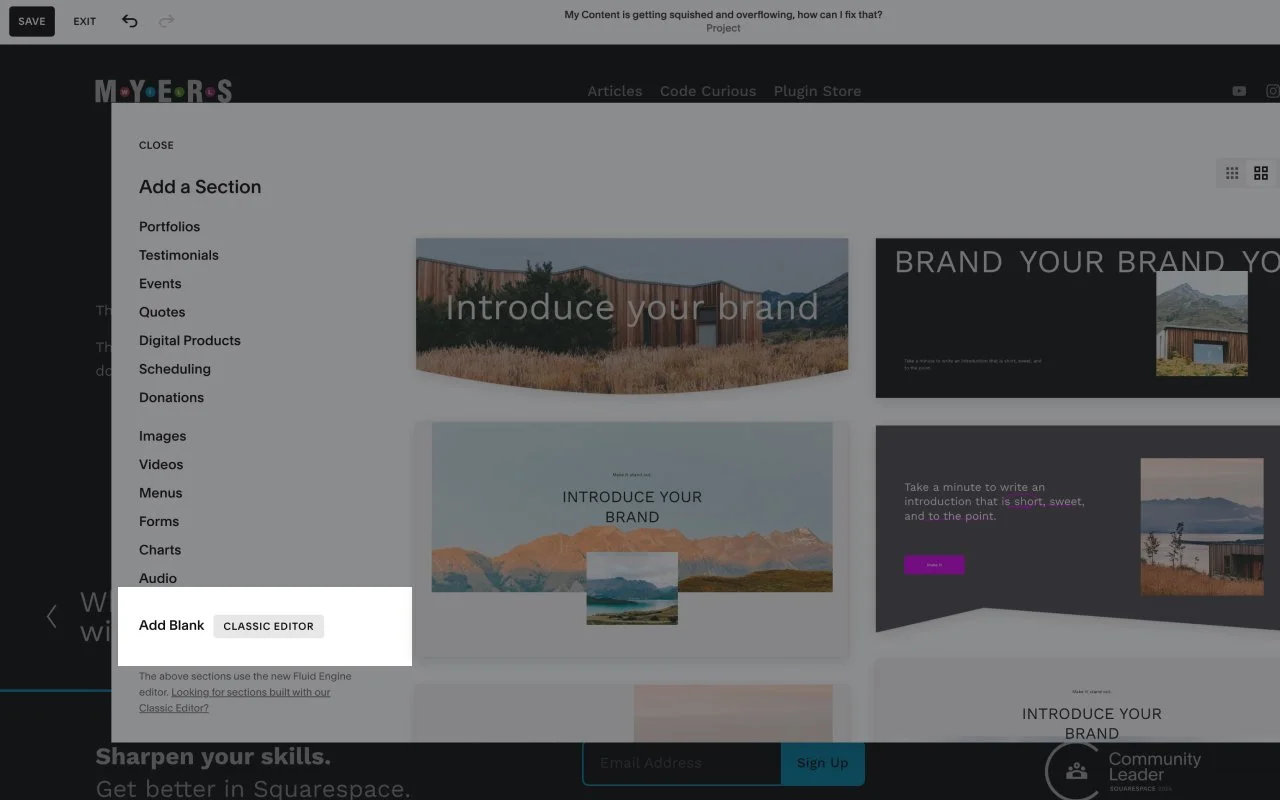
The solutions is to use a “Classic Editor” section instead of a Fluid Engine section, and be sure your blocks are stacked on top of one another.
The issue occurs because we’re pulling the desktop layout of the section into a smaller sized block (think mobile-sized). But Squarespace still sees this section as desktop, even though it’s much smaller, so the responsive styles aren’t getting applied. The Classic Editor sections allows for a more responsive approach.