
Highlight Accordion Block Style
Highlight the open item or when hovered over it in an Accordion Block.
Usage
Paste the code in the code block below into your Design » Custom CSS area.
You can adjust the Custom Property values. Custom Properties begin with two dashes ( -- ).
Options
--background: adjust the background color of the active & hover states of the accordion item.
--text-color: adjust the text color of the active & hover states of the accordion item.
/*Accordion Style - Highlight on Hover*/
.accordion-items-container {
  --background: hsla(0, 0%, 0%, .1);
  --text-color: initial;

  /*Defaults*/
  .accordion-item{
    margin:0px -17px;
  }
  .accordion-item > * {
    padding:0px 17px;
  }

  /*Hover State*/
  .accordion-item:hover {
    background:var(--background);
  }
  .accordion-item:hover button * {
    color: var(--text-color);
  }

  /*Active State*/
  .accordion-item[data-is-open="true"] {
    background: var(--background);
  }
  .accordion-item[data-is-open="true"] button * {
    color: var(--text-color);
  }
  .accordion-item[data-is-open="true"] .accordion-item__dropdown * {
    color: var(--text-color);
  }
}
Related Code Snippets
The below Code Snippets are available to Code Curious members.
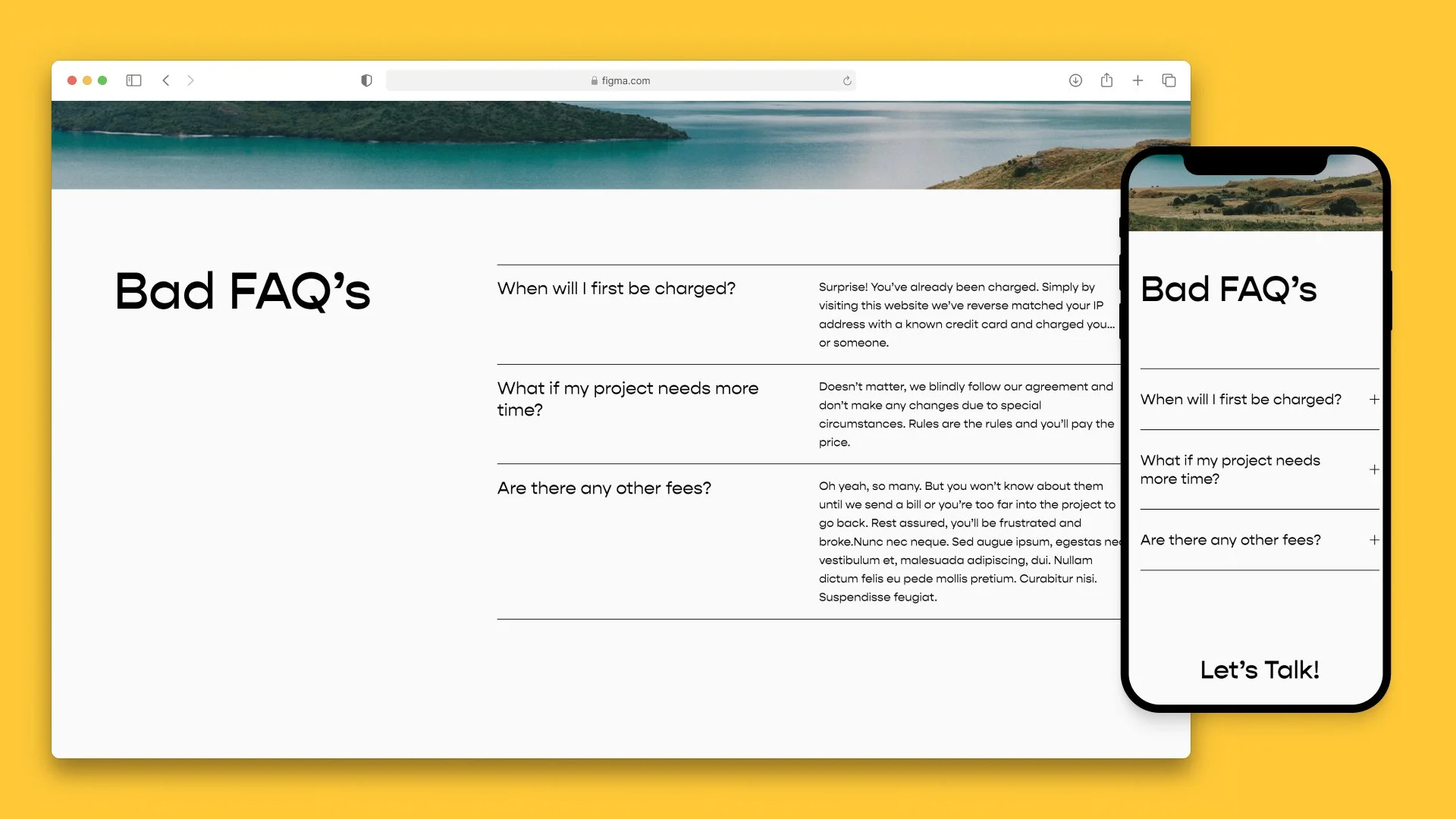
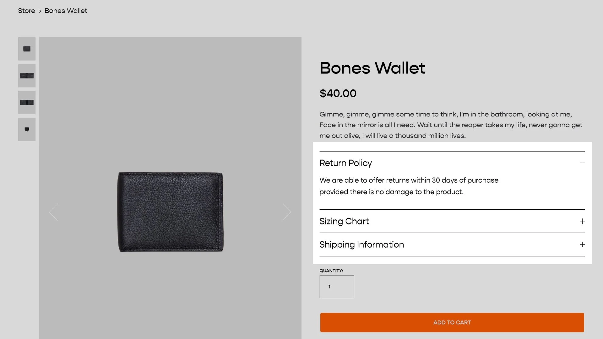

Spice up your accordions with some icons. Mix and match with other code snippets to add this to your product details area.